
The images from your dog's session deserve to live somewhere better than your camera roll.
Not because digital photos don't matter — they do — but because a photograph on your wall does something a phone photo never can. It's just there. Every morning when you walk past it. Every evening when you sit down. Every time a friend comes over and you get to tell them who that dog is and why you love them.
Here are three ways to think about putting dog photography on your walls.
1. One Large Statement Piece

The simplest approach.
A single large portrait as a focal point — above the mantle, above the couch, in the entryway — creates an immediate impact that a smaller print never achieves. The image doesn't have to compete with anything around it. It just gets to be seen.
The sizing guideline that actually works: your wall art should be roughly 60% of the width of the furniture it hangs over. For a standard 70-inch sofa, that means around 40 inches wide — which is why a 30x40 print is my most-recommended size for above a couch. It sounds large until you tape a piece of paper to your wall and stand back to look at it. Then it looks exactly right.
For a single piece, the image choice matters more than it does in a gallery arrangement. A portrait with a clean background and strong eye contact reads as graphic and statement making. An environmental shot — your dog as a smaller element in a larger landscape — can feel more painterly.
2. A Curated Gallery Wall

For clients who can't choose a single image — and honestly, most clients can't — a gallery wall lets the whole session tell the story.
The version that looks effortless is actually the most thought-through. A few principles that make the difference:
Make it feel lived in. Mix sizes and frames and mediums to help it look like it evolved over time. A gallery wall is also a great “grow with you” piece and we can plan ahead to have space to add as we have new sessions together.
Treat the full arrangement as a single piece. The outer dimensions of the whole gallery should still follow the 60% guideline relative to the furniture below. Measure the whole group, not the individual pieces.
Leave breathing room. Two to four inches of space between frames reads as intentional. Less than that looks crowded; much more looks like the pieces aren't related to each other.
The gallery wall is also the best format for clients who want to include a mix of their own meaningful images alongside the professional portraits — a wedding photo, a snapshot with the kids, an image from a trip. When it's curated well, that mix of sources feels like art.
3. A Matching Series
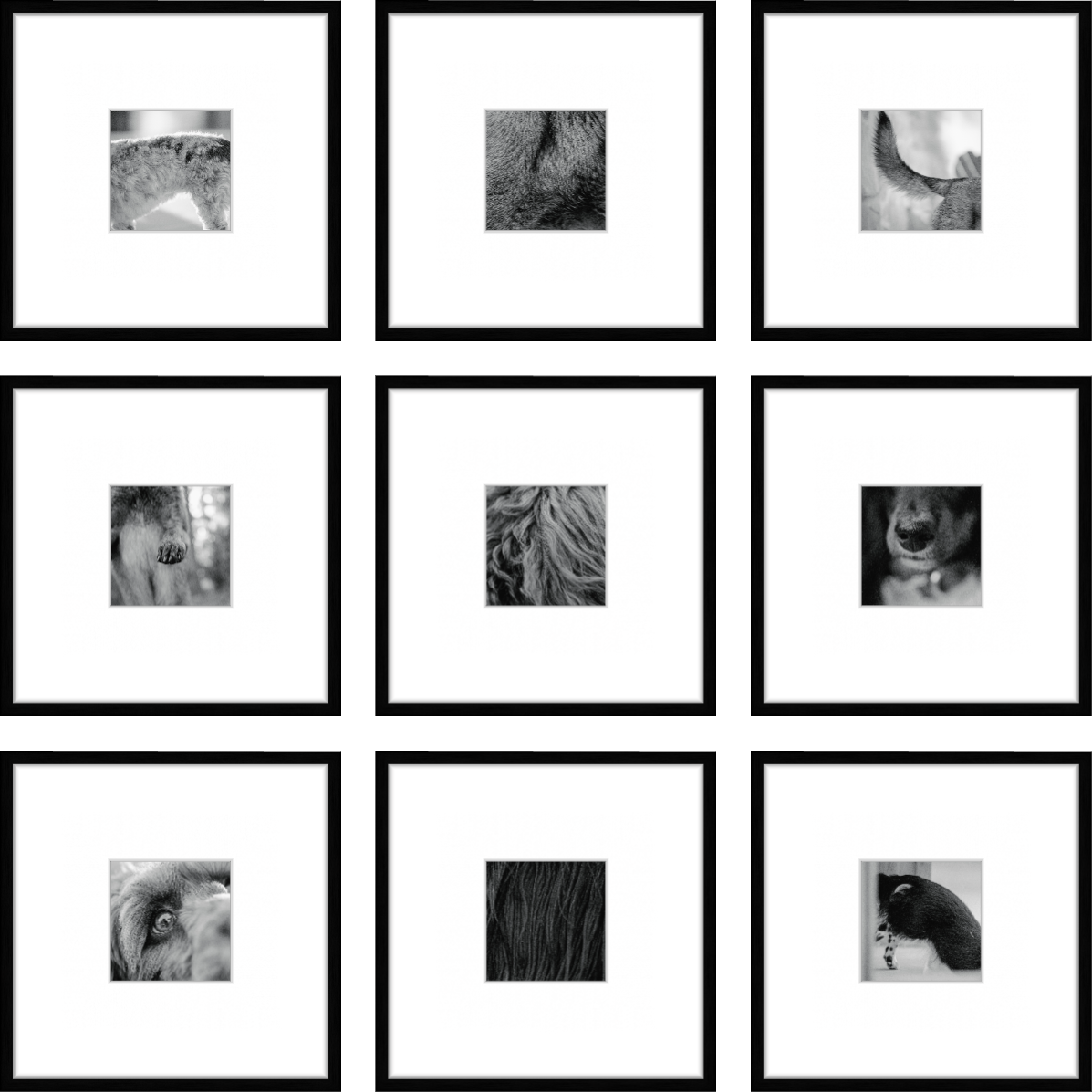
Want it to feel like modern art?
Try a series of zoomed in details in black & white.
The most graphic, most modern approach.
Choose three or more images from your session with similar tone, composition, or color palette. Print them identically: same size, same finish, same frame. Hang them in a clean horizontal or vertical line.
The repetition is what does the work. It signals "this was designed" rather than "this happened." And for dogs — especially if you have multiple dogs — it's a beautiful way to give each one their own portrait while keeping everything visually cohesive.
This approach works particularly well in hallways, stairwells, and home offices — anywhere the sightline is linear.
One Thing Worth Thinking About First
Before you decide on placement or format, consider where the portraits are going to live and what's already in that room.
The most seamlessly beautiful wall art is the kind that looks like it always belonged there — where the tones in the image echo the tones in the furniture, the curtains, the rugs. That's not something that happens by accident. It's something we plan for together before your session, so the final artwork lands exactly where it should.
→ How to hang wall art like a pro — the sizing, the height, and the rules worth following
→ Read next: